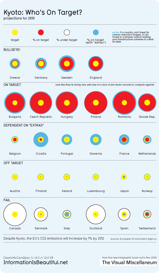
I love graphs. I really do. And I just found this Information Is Beautiful-graph by David McCandless (CC-Lizenz) and thought I should share it.
At first I had a few difficulties to understand it, but then I read David’s explanation:
If the red circle (% on target) is larger than the yellow, the country is doing well.
If the red circle is smaller than the yellow, it’s doing badly
If the blue circle is larger than yellow, the country is relying on ‘extras’ to hit its targets.
If the country has a white circle, its emissions have actually increased. It’s substantially under-target.

Have you been aware of the presented data? I guess there is a lot of interpretation to do here.
For example, I was very surprised by Denmarks bad performance as the country did present itself very aware of the whole problem when we were there. On the other side Germany is doing quite well. Is this a result of the green party being in power for some years, or are the country’s Kyoto limitations only very weak?
This post is also published as part of the international Th!nk 2 blogging contest – feel free to comment on this topic there
